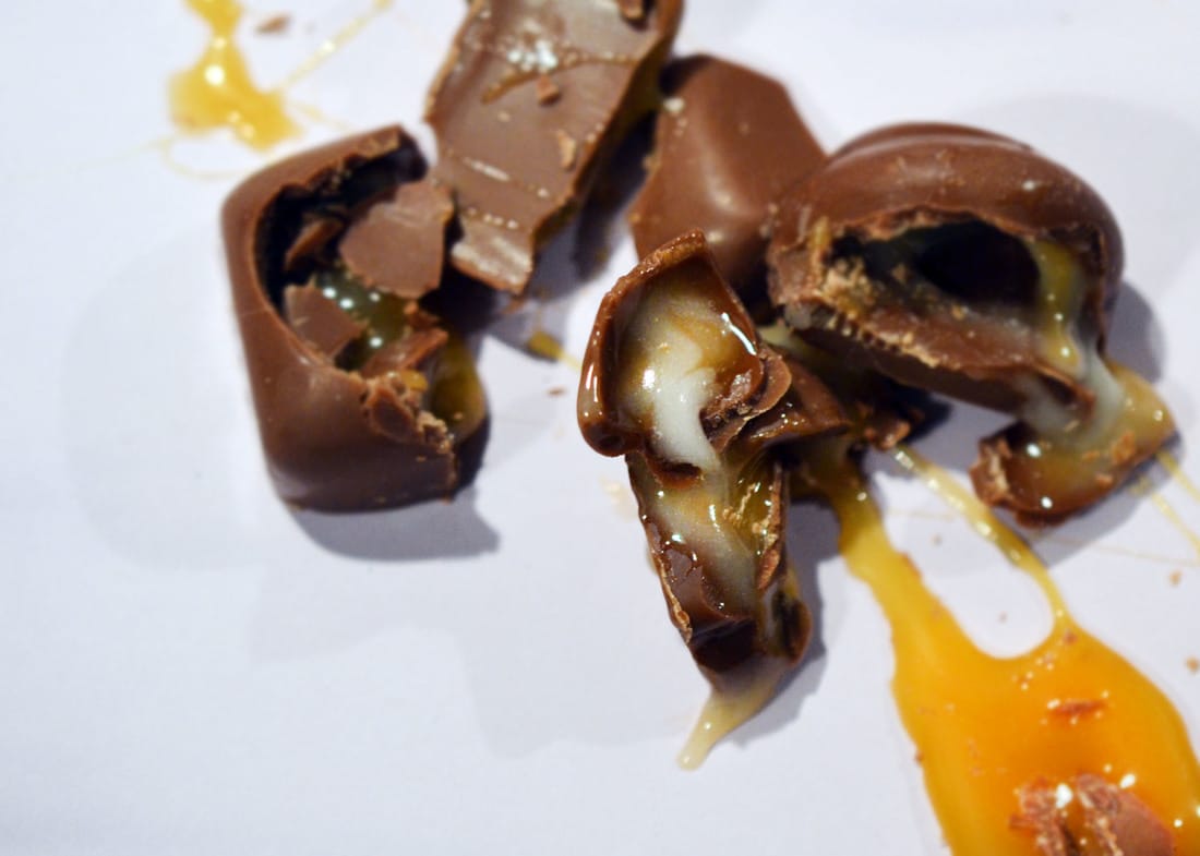
With this photograph, I used Photoshop. I changed the brightness and the contrast of it. I then used the 'curves' tool to create a brighter image with parts of it darker. I wanted to focus more on the caramel inside the chocolate rather than the actual chocolate itself. So for this I used the 'blur' tool and made the hardness of it at about 50% so you can still see parts of the chocolate. For the caramel, I used the 'sharpness' tool and made the front part of the caramel sharper to make it stand out more. Personally, I thought it started to look a bit like lava so I tried using the 'dodge' tool to make it a little bit brighter which then created the more orange part of it making it look more like lava.
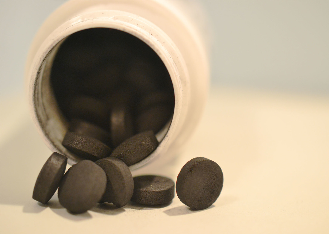
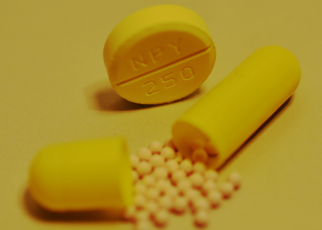
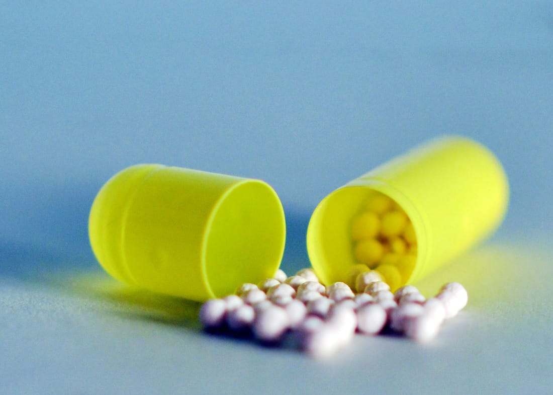
Again, I used photoshop, I used the 'curves' tool to make it brighter but then slightly darker in some places. I then used the 'sharpness' tool to make some of the tablets a lot sharper than others, for example the ones out of the pot and the two on the edge have been sharpened whereas the ones inside the pot have but blurred out by using the 'blur' tool. I also used the 'blur' tool to fade out the back of the pot so it fades more into the background.
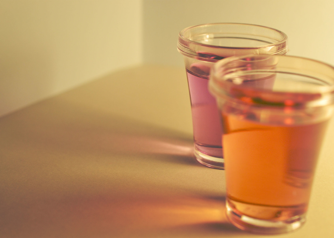
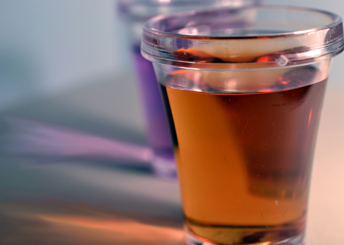
I put this photograph in Photoshop, I went onto 'image' then to 'auto tone' which changed the colour of the shots slightly. I then used the 'curves' tool to make it brighter on one side than the other so it gradually gets darker. When it came to the light reflecting off the shot, I used the 'sharpness' tool to make it stand out more. I again used that tool to sharpen the shot at the back, so I then used the 'blur' tool to blur out the front shot and the whole area. I also used the 'dodge' tool the make it brighter because I wanted to focus more on light with this image.
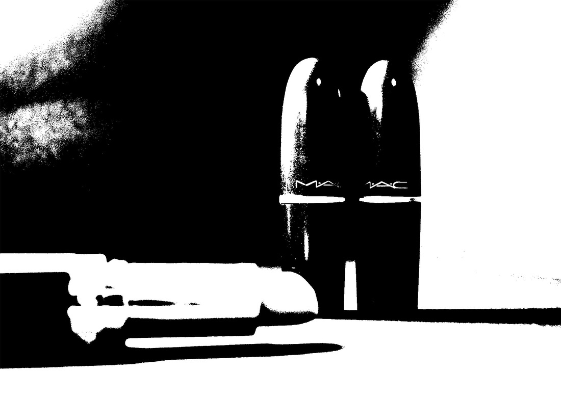
Using Photoshop, I developed this by going on 'image' then 'adjustments' then to 'threshold' which created this black and white solid contrast . I then used the 'sharpness' tool to make the lettering on the two lipsticks stand out which I personally think works effectively.
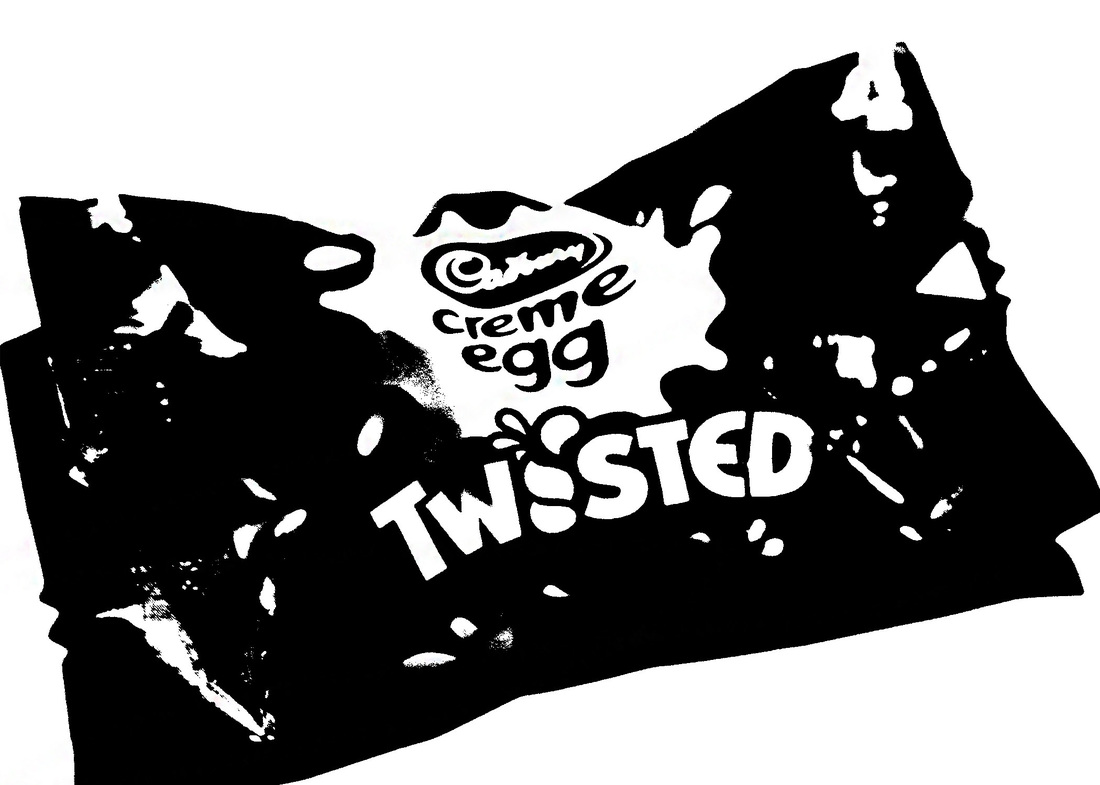
For this photograph, I used Photoshop, just like the last image on here using the 'threshold' tool to create a dark cartoon like filter for the image. I then used the 'sharpen' tool to make the lettering on the wrapper stand out.
To make this photograph all a similar colour to the actual tablets, I went on 'image', then to 'auto colour' which changed the colour slightly to a bit darker. I then used the 'curves' tool to make it gradually get darker. I then used the 'sharpen' tool which I used to make the tablet at the back stand out more especially because of the writing on it. So I used the 'blur' tool to blur out the tablet at the front and the inside of it.
For this image I went onto 'image' then to 'auto contrast' and 'auto tone' this changed the image to a slight blue colour which made where the lighting came from really light. I then used the 'sharpen' tool to sharpen the front shot and the glass of it, and the 'blur' tool to make the purple shot faded. To make the light reflection of the shot stand out more I used the 'smudge' tool which made it spread out a bit more, to make it brighter I used the 'dodge' tool.
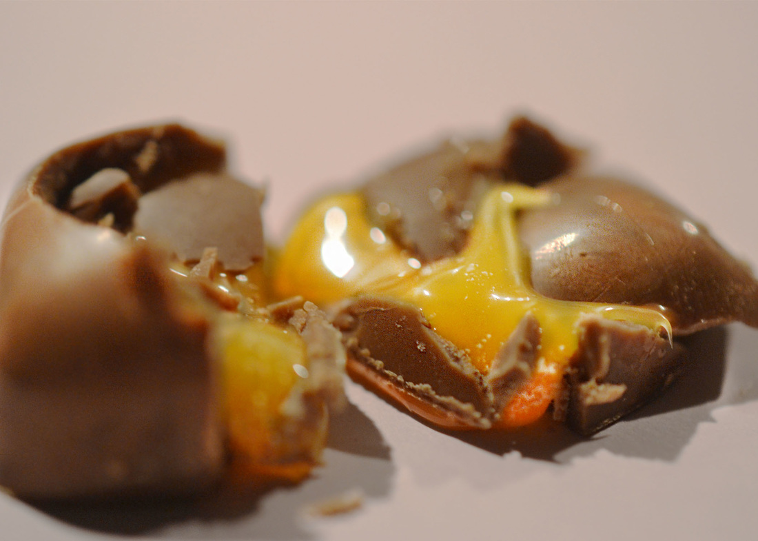
For this photograph, I cropped the picture so it got mainly the chocolate and the caramel in it. I used 'auto tone' which changed the tone of it to being brighter and whiter. I then used the 'sharpen' tool to sharpen the caramel inside the front smashed chocolate. I then used the 'blur' tool to blur out the other parts of the image. I also used the 'curves' tool to make it slightly brighter and darker in some areas.
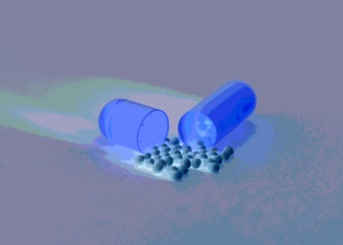
To develop this photograph, I went onto 'image' then to 'auto tone' and 'auto contrast' which changed the colouring to more of a blue colour. I then used the 'sharpen' tool to sharpen the front open capsule and some of the balls that are outside the shell. I also used the 'blur' tool to blur out the back of the casing and the balls inside of the shell. To make the image brighter I used the 'dodge' tool all over.
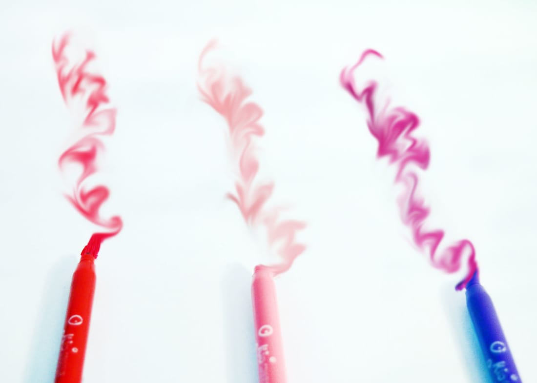
For this one, I wanted to make a bright image. Using photoshop, I went onto 'image' then to 'auto colour' which made the background white rather than cream. I then used the 'dodge' tool two times to make it brighter. I then used the 'smudge' tool to smudge what was the lipstick to make it into swirls, I then used the 'sharpen' tool over the top of the swirls and then used the 'smudge' again I personally think it looks like smoke as it fades out at the top. For the pens, I used the 'blur' tool to blur it out a bit so it was focusing more on the swirls.
For this photograph, I cropped it slightly so the tablet seems bigger. I then used the 'invert' tool which changed it to the negative, blue colour. After that, I used the 'posterize' tool, which I changed the level to 12 which made it seem cartoon like. I personally like this one as it is different to the others that I have developed.
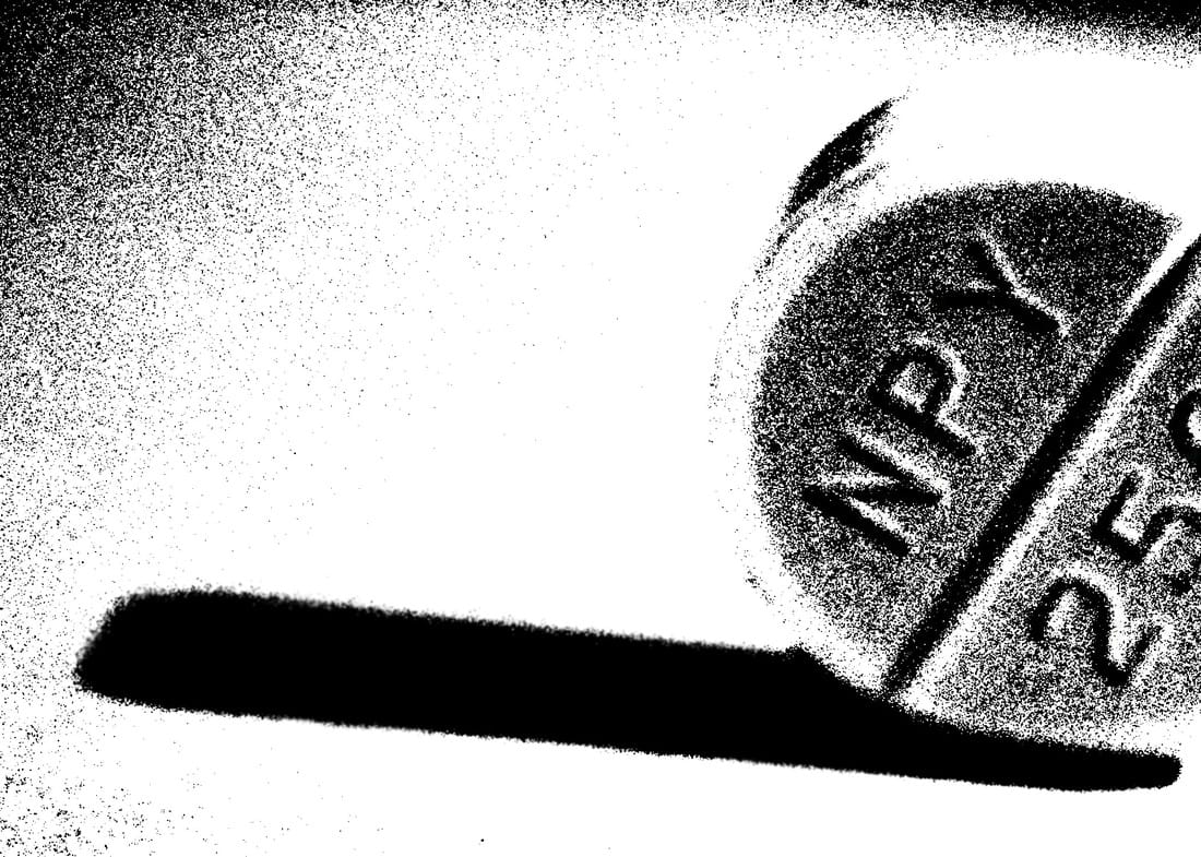
For this photograph, I cropped it and zoomed into the writing on the tablet. I then used the 'threshold' tool the change it into the black and white with the writing more defined.