For this Ed Fella project, I have decided to focus mainly on the colour that Fella uses because I like how he makes it look vintage. To change the colour effect on the photographs which I have taken, I used Pixlromatic, which has lots of different vintage style features.
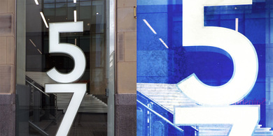
The development of this image included using a website called Pixlromatic. This website has the vintage and retro type filters and they also have the Polaroid layout. I then used Photoshop to make the 57 brighter than the background. I used the dodge tool for the 57 and then used the blur tool for the background to make it fade so the 57 really stands out. When it came to selecting one part of the image, I selected the part that I thought I could work with more, that is why I chose the 5 and then a small section of the 7.
|
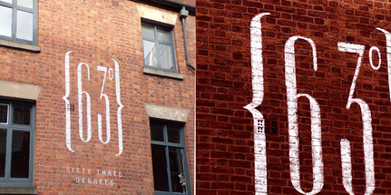
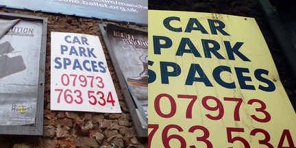
The development of this image was just done by using Photoshop. I zoomed into the picture more and selected the section that I thought would be the best to work with. I then changed the contrast of it to make it darker than what it already was. I again used the dodge tool to make the writing on the wall brighter and to stand out more.
|
The development of this image was done by using the Pixlromatic website. The filter I used for this picture was 'Aladdin'. I then used Photoshop to make the image darker, so I changed the brightness and the contrast. I also did this to make the image look less noticeable that I have used a filter.
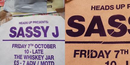
The development of this image was done by again using the Pixlromatic website. I used a much darker filter to change the way the photographs I took look. So, it shows the contrast between the lighter vintage and retro images to the darker images. Once I had used Pixlromatic, I then used Photoshop, again using the dodge tool to make the lettering brighter as Ed Fella focused a lot on lettering. I used the curve tool to make it gradually get darker mainly in the corners.
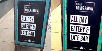
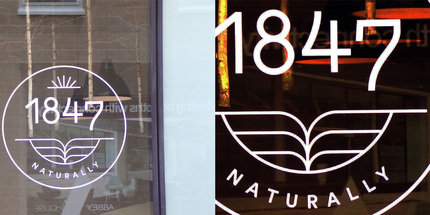
The development of this image was again done by using Pixlromatic, I then used Photoshop to sharpen the border of the sign and the lettering, I used the fade tool to fade the tiles in the background so that it wouldn't take the attention away from the actual sign. I decided not to select a certain part of the image because I really like the border of the sign as well as the lettering because I knew I develop both of them.
The development of this image was done by using Pixlromatic, I used the 'Anne' filter. I then went onto Photoshop to select a certain part of the image and then I changed the contrast of it and the brightness. I lowered the brightness as I wanted to again change from the bright retro idea to more of a grungy image.
